This is a powerpoint detailing my experimentation with the flat plan design, and is part of my planning for my final magazine.
Thursday, 16 December 2010
Thursday, 9 December 2010
Music Magazine Pre-Production
This is a powerpoint presentation showing off several moodboards and an early version of the front cover of my magazine.
My music magazine is all about mainstream music and music that is currently on the charts. It's target audience are youngsters, as the majority of chart and mainstream music is targeted itself at people aged between 15-30. The USP of the magazine is the exclusive interviews with up and coming stars, and the house style is generally a bit quirky and different. There is a cheerful tone to the magazine which I feel will help sell the magazine in these tough times.
Friday, 19 November 2010
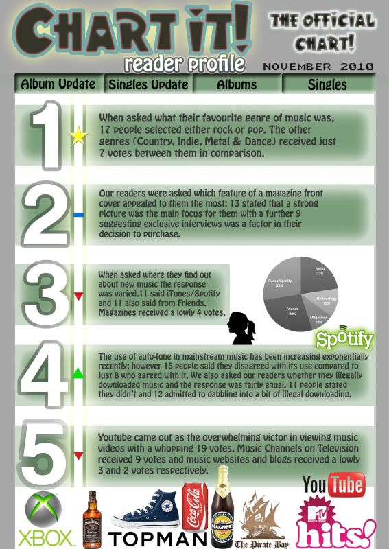
Reader Profile

This is a reader profile for my magazine. The survey where I collected the data from can be found here;
http://www.surveymonkey.com/MySurvey_Responses.aspx?sm=yXmNnekSHBSbNdg9JN5wQY5w1KLfTmQ0jM7h1kkBQ7awqkoe05W%2fIqb7gDBvvVq2
Friday, 5 November 2010
Music Magazine Analysis
This is my analysis of three music magazines; front cover, contents page and a double paged spread.
Friday, 8 October 2010
Front Cover and Contents Page
These are my completed Front Cover and Contents Page. I created these magazines with my target audience being teenagers and young adults, specifically those who are students in and around the area that the college is in. With this in mind I used larger and more striking fonts and colours which would draw in the attention of students despite being quite loud in appearance at the same time as being informative.
College Magazine Research
Powerpoint detailing my research into seperate College Magazines.
This is my powerpoint detailing the pre-production and production of my college magazine Front Cover and Contents Page, including how I made my decision on which fonts to use and how I edited my photos.
This is my powerpoint detailing the pre-production and production of my college magazine Front Cover and Contents Page, including how I made my decision on which fonts to use and how I edited my photos.
Friday, 17 September 2010
Magazine Cover
One of the reasons why I like this magazine cover is because it has cleverly used tools such as background blurring to give sections of the cover emphasis over other parts. Another reason why I like it is because the image gives off a positive radiance compared to other magazines of the same issue which are most often negative in appearance and message and it is refreshing to see things spun in a postive light sometimes. Also I like the fact that despite being relatively clean in appearance, there is still quite a high amount of information on the front cover which leads me to believe that it has been made with alot of thought and ideas about combining information and images but without overcrowding or being too minimalist. As a final point, personally I take a fair amount of interest in African affairs and therefore it's natural I would take a liking to a magazine about Africa, the state of affairs and aid expeditions to the continent.
AS Media Project(:
This is a blog to post my work on the magazine project which I am doing in my AS Media Lessons.
This is a magazine front cover I chose because it contains a dominating image, I like the way that the information fits well around this image and because I like some of Drake's music.
This is a magazine front cover I chose because it contains a dominating image, I like the way that the information fits well around this image and because I like some of Drake's music.
Subscribe to:
Comments (Atom)


